
5 Simple Tips for Logo Design to Help You Create Your Brand
When it comes to logo design, you want something that will represent your company. Not only should it be eye-catching and interesting to look at, it should also say something about who you are as a company. What’s your company culture like? What are you really proud of? All of this should be encapsulated by your logo. Plus, your logo also needs to be something that will stand the test of time instead of seeming outdated within a year or two. A logo should be something that helps you to create your brand. It might seem like you’re asking a great deal out of a simple logo but it is possible for you to get all this from good logo design. Here are a few tips to keep in mind:
- Is your logo eye-catching? There’s no simple way to determine whether your logo is eye-catching or not. Do you think it’s striking? When you show it to others, what’s their first reaction? The only way in which you can figure out whether a logo is eye-catching is by putting it to the test. So it’s a good idea to get your logo design company to come up with a few different logos, test them out and then decide which one works best.
- Is it simple? In general, it’s better to keep your logo simple. Very complicated graphics and long slogans aren’t as striking as short ones. Consider Nike’s check mark logo (actually a simple representation of a pair of wings) and its short slogan, “Just do it.” You’re looking for something simple like this because it’s easier for people to digest quickly and it stays in their minds for longer. A more complicated-looking logo with a longer slogan is harder to remember and won’t help you to establish your brand.
- 5 Principles of Efective Logo Design: Simple, Memorable, Timeless, Versatile, Appropriate.
- Check out Awwwards Logo Design Winners from 2013 for ingenious but simple logo design.
- Does it represent you? The most important thing about a logo is that it needs to represent who you are as a company. A logo might be really eye-catching and your slogan might be really memorable. However, if it doesn’t represent your company values, then don’t use it. You don’t want people to walk away with the wrong impression about who you are. So sit down and think about what company values you want to be encapsulated in your logo and speak to your logo design company about this.It is also important to state that that a logo doesn’t need to show what a business sells or offers as a service. ie. Car logos don’t need to show cars, computer logos don’t need to show computers. The Harley Davidson logo isn’t a motorcycle, nor is the Nokia logo a mobile phone. A logo is purely for identification.For further evidence of this, take the top 50 brands of the world – 94% of the logos do not describe what the company does.
- Does it seem up to date? A logo should be timeless, yet it should never seem outdated. You don’t want a logo that looks like it was made 20 years ago. For example, logos that contain images of technology that was in use many years ago, like a typewriter or an old-fashioned landline phone, might create the impression that you’re not in touch with current trends. On the other hand, they might look interesting in a retro kind of way. It all depends on your demographic. So keep your audience in mind when using older images in your logo. It’s always safer to go with something that seems more cutting edge.
- Is it something people would like to show off? One important characteristic of good logos is that people like to show them off. You see people carrying their MacBooks and iPods around proudly and displaying the apple logo on them. So it’s a good idea to consider whether your logo has been designed in such a way that people would like to be seen carrying the product that bears it. If your logo is sewn onto a shirt, is it something that enhances the style of the shirt or detracts from it? The unobtrusive yet clean Benetton logo is a good example of something that makes a shirt look a little bit nicer rather than detracting from its stylishness.
You will notice that nearly all of the logos below use free standard issue fonts and don’t assign to the rules of what makes a good logo. Ie. describable, memorable, effective without color and scalable.

Ask yourself these questions in regards to the logos above:
- How many of the logos can you describe or remember?
- Are these logos effective without color?
- Are they scalable?
- Do they gain immediate recognition?
- Convey the company’s personality, character or attitude?
- Relate to your clients by conveying a feeling of familiarity and credibility?
- Have association with quality and satisfaction?

More Articles
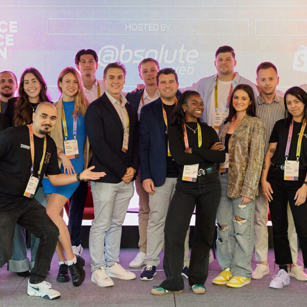
EEE Miami 2024: A Monumental Success
The buzz of EEE Miami 2024 has finally settled, leaving…
Read more

Enterprise Ecommerce: Benefits of Migrating from Salesforce ...
In the fast-evolving landscape of e-commerce, selecting the right platform…
Read more
3 Ways to Personalize the Customer Experience
In today’s ecommerce landscape where competition is fierce, standing out…
Read more

Ecommerce Growth Strategy Over Hype: How Not ...
If you’re in ecommerce, there’s no getting away from the…
Read more

Top Ecommerce Conferences and Marketing Events to ...
In a rapidly evolving industry like ecommerce, staying ahead of…
Read more
Inc. 5000 & Absolute Web: Celebrating 6 ...
It’s with immense pride and gratitude that we announce Absolute…
Read more

The Most Inspiring Ecommerce Event. EEE 2023 ...
On February 23rd, the second edition of Ecommerce Experience Evolution…
Read more

What Shopify’s Checkout Extensibility Update Means for ...
Shopify Plus, an enterprise-level version of the popular Shopify ecommerce…
Read more
Social Feed